Interlocutor
A small side chat.
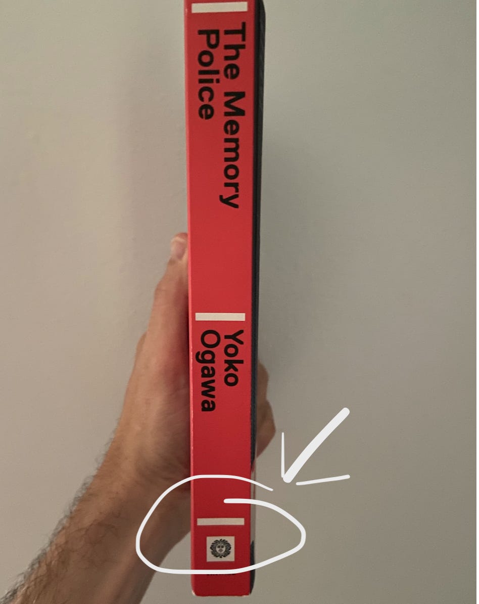
Whenever I see a publishing house’s logo in a white box surrounded by color on a spine, I am pretty certain that one of the following is true.
The printer was tasked with switching out the logo for the book and this is what their file department did. This is unlikely. Printers won’t touch any files, at all, for fear of a mistake and getting stuck with a book run cost.
A designer was in a hurry at the publishing house and had a ton of titles to convert to paperback, or the title changed imprints between runs, and they didn’t notice.
It’s intentional. This is very unlikely.
What am I talking about? See the Vintage logo on the spine of this book? If you look at the working file for this book, the logo will be on a separate layer. The white box is not really a box, it’s the blank area of the logo file. There are strict guidelines for our an imprints logo should be treated on the spine, title page, and back cover. The correct usage would be for the red color to surround the icon.
Which leads us to another possibility.
The publisher lost the working files for this book, could only access the PDF print file, and plastered the logo on the spine for print. They still could have flown that into Photoshop and fixed it. But, I digress.
Maybe there is another reason. At any rate, I stew on this every time I see a book like this.


I love your eye for that sort of thing. Sometimes I think I obsess over little details in packaging or page design, but no. When people don’t pay enough attention to the details, we get crap. And the world is full of enough crap, we owe it to the rest of the species to keep our contribution to a minimum.
This is a highlight reel of things that can go wrong in my life. :D